Burning Deck Press is a space for experimental poetry as well as translation from both French and German. Despite the avant-garde nature of its poetry, Burning Deck’s aesthetic clearly prizes content over form. The way the type is aligned on the page may initially give Burning Deck books a somewhat simple appearance, but it is this simplicity that draws the reader deeper into the richness of the poetry at hand.
I chose to look at two different Buning Deck publications: Michael Donhauser’s Of Things and Lisa Jarnot’s Some Other Kind of Mission. Both texts have numerous qualities that make them unique works of art and showcase Burning Deck’s captivating style.
The book by Donhauser is the simplest of the two, illustrating Burning Deck’s more “classical typography” style (Schlesinger 19). All the poems are categorized into three sections- Winter: Spring, Spring: Summer, and Summer: Fall. The text itself is set in a typical, left aligned format, which allows for the words of the poems to really take effect. Translated from German, each poem is a beautiful description of various things in nature that fits the overall theme of the poem. In this collection, Burning Deck’s preference of content over form is quite apparent.

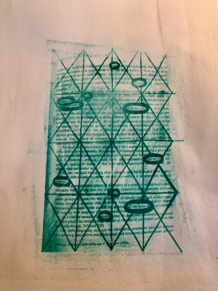
Of experimental texts Rosmarie Waldrop says, “The more experimental the text, the more clearly I want to define the space of the page (Schlesinger 19).” This is evidenced in Lisa Jarnot’s Some Other Kind of Mission through the way that the pages of the book are left mostly blank. This slightly more experimental approach could very well be the inspiration behind my own blackout poem pictured below. My print was already created before the writing this post; however, I think the project fits well with the style of Jarnot’s text. This piece has a slightly less traditional layout, with pieces of the text set next to images of blackout poems and other small art pieces. Overall, the combination of textual layout and the visuals is a great showcase of Burning Deck’s experimental side.

In a way, my poem is a combination of both styles of the Burning Deck books I chose to look at. The form is reflective of the blackout poems present in Jarnot’s piece, and the content is reflective of the natural imagery of Donhauser’s poems. Unlike many Burning Deck publications my poem places form over content; however, it still fits within the press’s creative mold as a piece of visually simplistic poetry. As a result, I unknowingly creating a somewhat Burning Deck-esque print a little while before I even learned about the press.
I’ve said something similar in a different post about letterpress, but there’s something truly special about the products of letterpress publishing. It’s the care and work put into the production of each piece that adds so much value. Evidence of this comes from Burning Deck’s note on the very last page of Jarnot’s text that says, “This book was typeset in 10 pt. Palatino by Rosmarie Waldrop… There are 1000 copies, of which 50 are signed by the author.” Reading this inscription made the book feel even more like an intimate little treasure I was able to find, which is one of the many reasons I am fascinated by letterpress.
Works Cited
Donhauser, Michael. Of Things, translated by Nick Hoff and Andrew Joron,Burning Deck Press, 2015.
Jarnot, Lisa. Some Other Kind of Mission, Burning Deck Press, 1996.
“Kieth and Rosmarie Waldrop: Burning Deck Press,” 2012. A Poetics of the Press, edited by Kyle Schlesinger, Cuneiform Press & Ugly Duckling Press, 2021, pp. 14-23.

Where I think you captured the Burning Deck spirit in your blackout poetry is through the geometric patterns. The circled words connected through a chain-link fence-esque pattern defines space. Perhaps this is not what Rosemarie Waldrop had in mind, but it executes the sentiment well.
LikeLiked by 1 person
I love how Burning Deck Press provides a personalized space for experimental poetry, in addition to translation techniques that involve both French and German languages. I like how you explain that Burning Deck’s aesthetic praises content over form-this is a crucial point. I really enjoyed reading through your blog as you reflected on your blackout poetry in relation to the style of Burning Deck books.
LikeLiked by 1 person
Your print and blackout poetry fits so well with the Burning Deck Press! It’s interesting how Burning Deck focuses more on the content rather than the art form, for many of the presses today seem to have a good mix of both or gravitate more toward the artsy side. Seeing their simplistic poetry is always such a nice change of pace, and since they’re really particular with what they choose, you’ll never be disappointed with whatever you read!
LikeLiked by 1 person
You captured the spirit of Burning Deck so well with your discussion on “experimenting”! The ideology of experimenting is what makes the content of the press’s books so monumental. With this mindset of experimental publishing, there can never be any “mistakes” because there is no form or template attempting to be recreated, and after all, that’s what small presses are all about-being independent from the Big Six publishers and doing things differently. Your poetry and its accompanying print perfectly describe Burning Deck!
LikeLiked by 1 person
Brief shoutout to the text of your poem, which is beautiful, and so resonant as a little riddle about publishing, about books: “light, music, and harmony/masterpieces of symmetry/revealing structure/in all the faces of space.”
Very nice discussion.
LikeLike